

COMMUNICATING WITH COLOR
“The first of all single colours is white … We shall set down white for the representative of light, without which no colour can be seen; yellow for the earth; green for water; blue for air; red for fire; and black for total darkness, ” Leonardo Da Vinci
Colour choices can be credible, predictable and effective, based on research and market trends on colour psychology and colour communications. Our extensive research background and experience in colour trends and consulting for the commercial and residential project can enable the customers discover the subliminal emotional meanings of each colour family, along with the most effective colour combinations for getting that messages across to the right audience. These essential guidelines and consulting can be applied to a variety of projects in retail stores, hotel design, leisure & entertainment, wellness & spa and more.
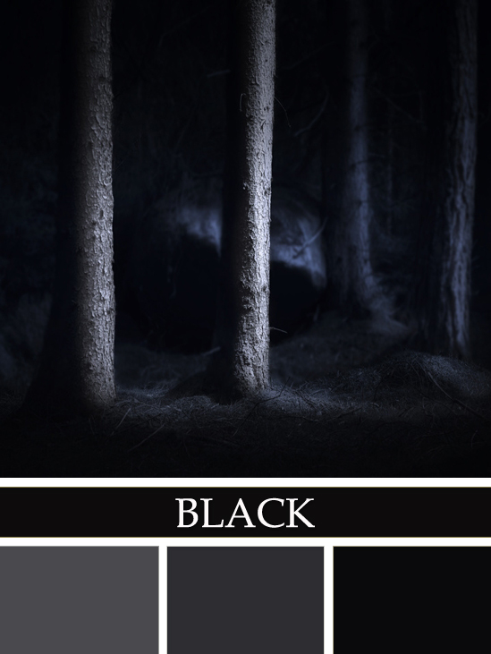
BLACK is authoritative and powerful; Black represents a lack of colour or the primordial void. It causes the feeling of inconspicuousness providing a restful emptiness in a mysterious way. Too much black can be overwhelming, yet when combined with the loyalty of blue then results in the culminating colours of midnight blues.
“Black is real sensation, even if it is produced by entire absence of light. The sensation of black is distinctly different from the lack of all sensations.” — Hermann von Helmholtz
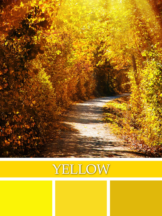
YELLOW shines with optimism, enlightenment, and happiness. Shades of golden yellow carry the promise of a positive future. Yellow will advance from surrounding colors and instill optimism and energy, as well as spark creative thoughts. Stimulating mental activity, activating memory, encouraging communication
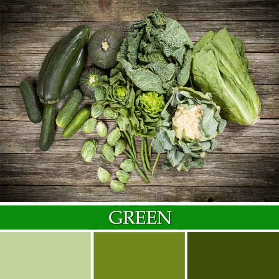
GREEN is the pervasive colour in the natural world, occupying more space in the spectrum visible to the human eye than most colours and is second only to blue as a favourite colour. The natural greens, from forest to lime, are seen as tranquil and refreshing, with a natural balance of cool and warm (blue and yellow) undertones. Green is considered the colour of peace and ecology, revitalization and rebirth.
“Absolute green is the most restful colour, lacking any undertone of joy, grief, or passion. On exhausted men this restfulness has a beneficial effect, but after a time it becomes tedious.” Wassily Kandinsky
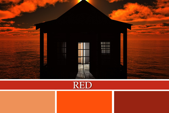
RED has more personal associations than any other colour. Recognized as a stimulant, red is inherently exciting and the amount of red is directly related to the level of energy perceived. Red draws attention and a keen use of red as an accent can immediately focus attention on a particular element. Stimulating, energetic, vibrant, increasing heartbeat and pulse, indicative of danger
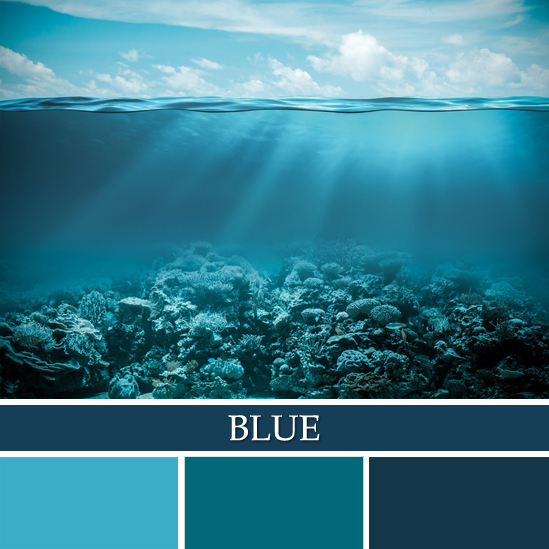
BLUE is perceived as trustworthy, dependable and committed. The colour of ocean and sky, blue is perceived as a constant in our lives. As the collective colour of the spirit, it invokes rest and can cause the body to produce chemicals that are calming. However, not all blues are serene and sedate. Electric or brilliant blues become dynamic and dramatic — an engaging colour that expresses exhilaration. While blue is the colour of communication with others, indigo turns the blue inward to increase personal thought, profound insights, and instant understandings