

DOTS & LINES SPATIAL IDENTITY
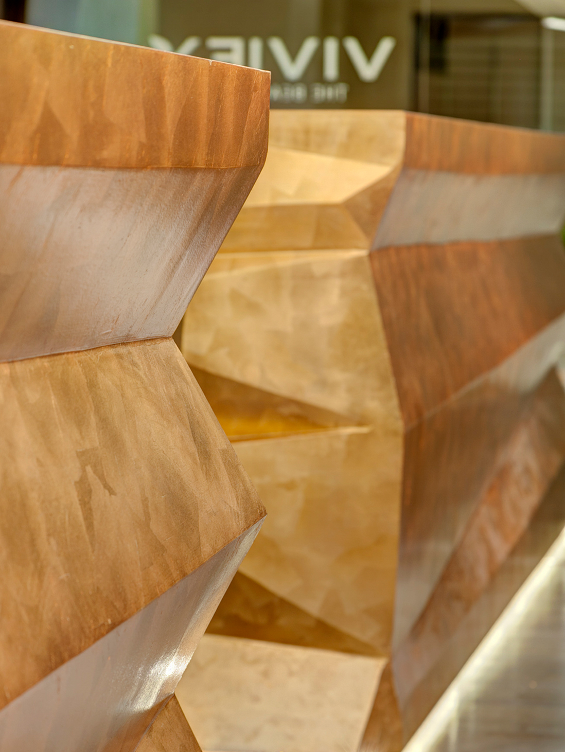
Earth and Metal dominate a high and aesthetic cosmetology treatment center. The multifaceted structure of ceiling and walls acts like an abstract cave, allowing natural daylight to flood the office and accounting areas behind them. The two reception modules are gilded in copper
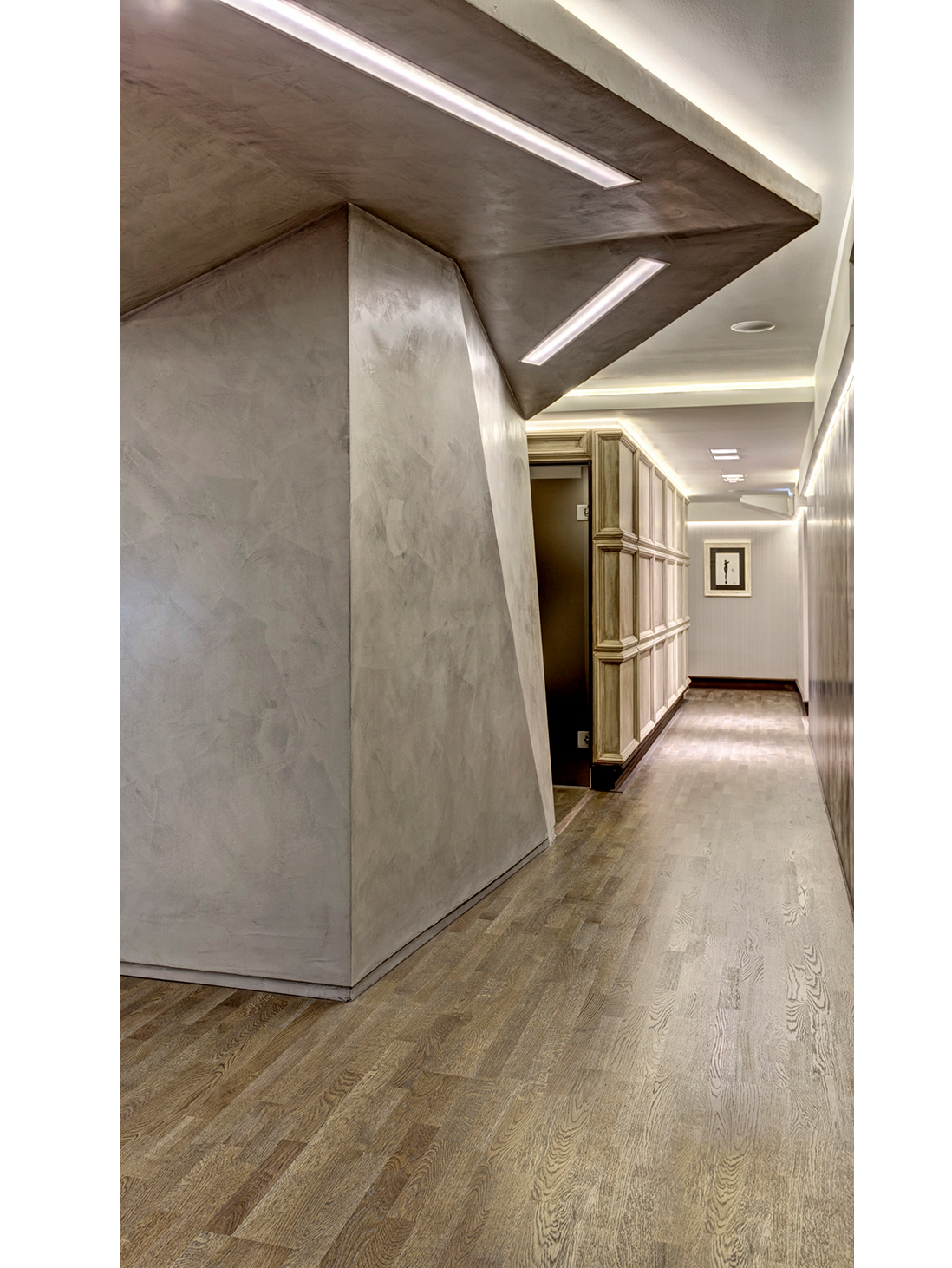
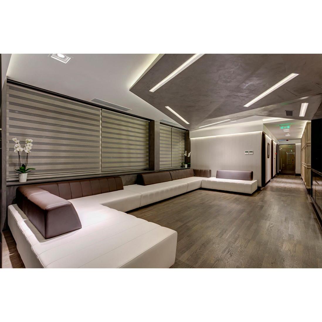
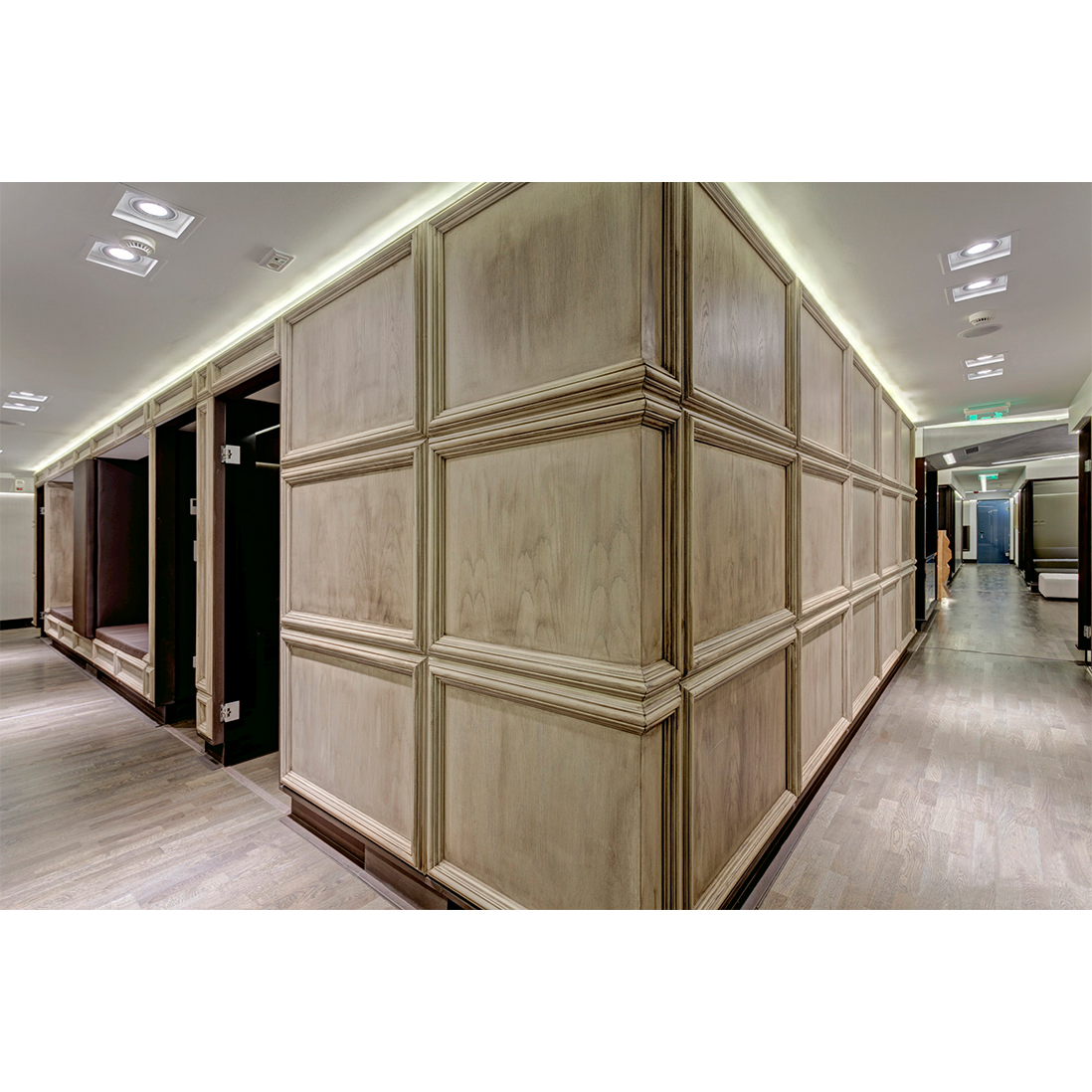
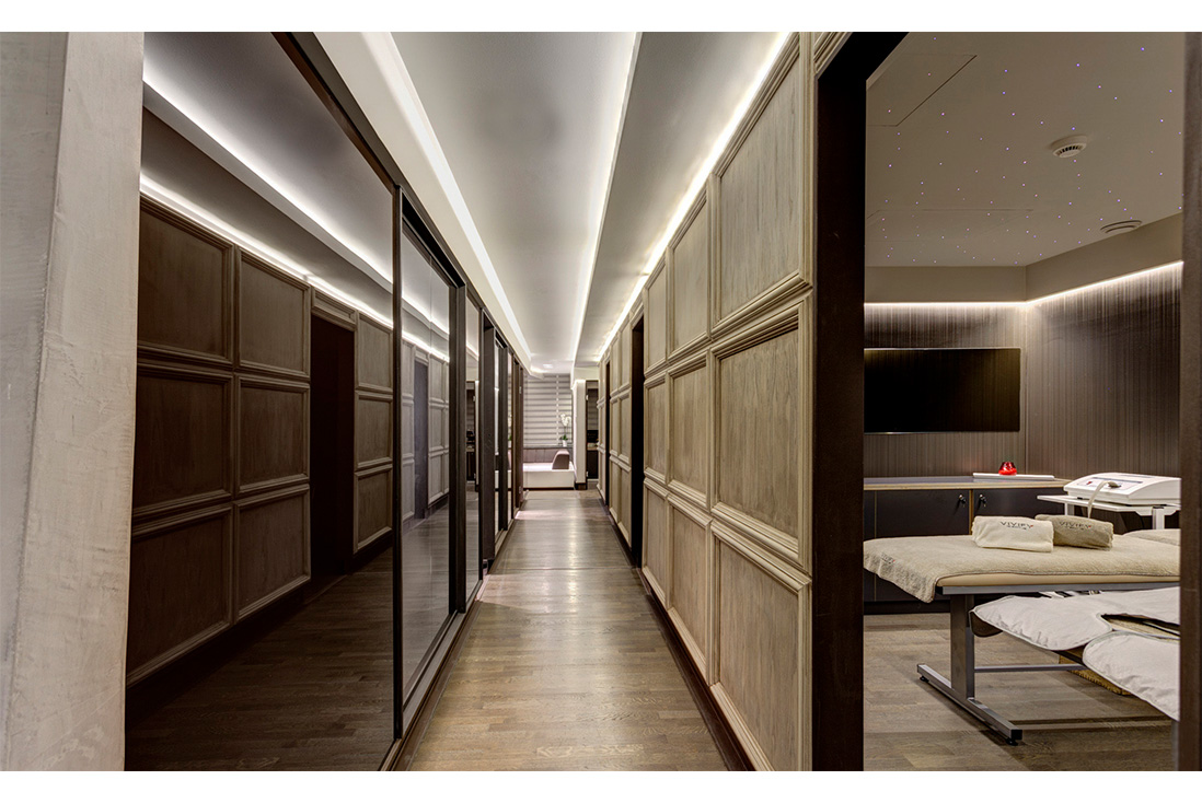
The design approach is a metaphor of inner beauty that every person holds similar to a stone that needs some refinement before its transformation to a gem. Corridors and traffic zones have been designed as ring roads around geometric volumes that offer customized treatment and therapy plans. These hallways exhibit etchings and paintings by contemporary artists and engravers. Linear Led Lighting indicates movement, while round recessed ceiling fixtures indicate pausing in front of private treatments. Dots and lines a coded corporate branding identity
“The best part of beauty is that which no picture can express”, Francis Bacon
CLIENT LINK